|
|
Post by zifu on Jul 10, 2007 21:51:31 GMT -5
|
|
|
|
Post by falcon on Jul 10, 2007 22:48:32 GMT -5
I think both the last one and the first blue one are good. The last one the best of the two.
|
|
|
|
Post by dullfork on Jul 11, 2007 6:46:56 GMT -5
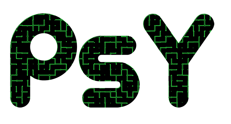
woah  also, try something more cyber-punk-ish? Just curious as to what you could come up with. |
|
|
|
Post by PsY | AzraeL on Jul 12, 2007 16:20:50 GMT -5
I think that the 2nd one is amazingly well done. We'll see if we can't coordinate between your's and sprites concepts. Prolly going to make one a front and one a back, but I think that it's perfect.
|
|
|
|
Post by zifu on Jul 14, 2007 22:19:42 GMT -5
Ok -- I messed around for a bit more;   |
|
|
|
Post by zifu on Jul 14, 2007 22:20:09 GMT -5
Oh yeah - ignore the transparency on the first one  |
|
|
|
Post by zifu on Jul 16, 2007 2:25:55 GMT -5
|
|
|
|
Post by jelly on Jul 16, 2007 11:48:13 GMT -5
BIGGER IMAGES PLX
I like the first pics in this page, all of them are great.
|
|
|
|
Post by warsprite on Jul 16, 2007 13:08:26 GMT -5
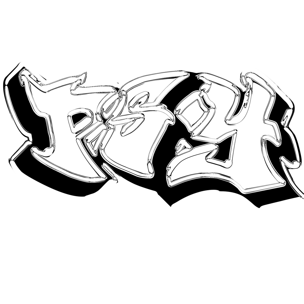
Of these, the 2nd and 3rd are my favorites. I'm not really into the graffiti-style ones. Not because they're done poorly or anything, its just not my thing.
|
|
|
|
Post by zifu on Jul 17, 2007 3:13:33 GMT -5
Well I have a huge monitor and I edit things at 150px/inch or so usually so they end up huge unless I decide to resize them.
|
|